This essay was co-authored by Andrew Kortina and Namrata Patel.
In the media, you’ll often hear cursory references to “the 1%,” basic income, and “taxing the rich” without any specific measurements quantifying the broader impacts or side-by-side comparisons of alternatives.
One exercise that can be useful when evaluating the major levers on a business is a “napkin math” sensitivity analysis – this typically involves sketching out a rough model in a spreadsheet where you can toggle the major levers and observe how changing them impacts other key business metrics.
We thought it would be fun to put together an open source spreadsheet that makes it easy for anyone to napkin model the US government “P&L” – specifically, we wanted to compare the surplus revenue generated by changes to federal income tax rates.
Takeaways First
Because this is a lengthy and somewhat technical post, we are taking a friend’s advice and leading with our key takeaways.
Our napkin model is far from perfect, and we’re not necessarily advocating for any of the scenarios compared in this post. Rather, the point of this exercise was to try to get a better understanding of the implications of headline numbers we see in the media.
Building the model definitely helped us gain a more clear picture of the relative portions of tax revenue generated by households in different earning bands.
One thing that stuck out was how much tax revenue (38%) is indeed driven by the middle class, because there are so many households (41%) earning between $50k and $200k.
It was also revelatory to see that households earning less than $100k contribute 22% of tax revenue, whereas the top 5.48% of earners ($200k+) contribute 55% of tax revenue.
Perhaps the most striking insight was that equal redistribution of all taxable income to residents age 19+ yields $31,006 / person, which is a few hundred dollars short of the annualized living wage ($31,680).
This exercise of evaluating the federal budget as we would model a business led us beyond a simple comparison of various tax rates to a consideration of the side effects of changing tax rates and effective uses of surplus tax revenue. While it’s easy to discount any opposition to increased taxes as the self-interest, our exploration led us to thinking less about our own interests as taxpayers and more about the broader systems challenges: labor incentives, capital flight, inefficacy of government spending, etc.
Last but not least, our exercise led us to the surprise / bonus idea of pegging federal government leadership salaries to the US median income (perhaps the only concrete idea from this post we would advocate for implementing).
From here, we’ll dive into how we compiled the model and the scenarios we considered.
Compiling the Data: Simplifications & Assumptions
The tldr; if you care to skip past this section, is that our model computes a ceiling on the tax revenue the IRS would generate with the toggled tax rates.
The spreadsheet contains raw data from a number of sources, but the napkin model is primarily driven by 2016 income tax return data from the IRS.
The IRS breaks out their data into a number of brackets based on Adjusted Gross Income, a distinct measure from Modified Taxable Income (see this pdf for definitions). Each band in the IRS sheet 2016-IRS-16in31mt is further broken out by type of filing: Regular, Form 8615, and Schedule D filings.
As the whole point of napkin modeling is trading detail for speed and simplicity, we make the following simplifications:
(1) We merge filings of different types into one row per income band in the collapsed sheet.
(2) Our model allows you to toggle the effective tax rate for each Adjusted Gross Income Band. Adjusted Gross Income tends to be higher than Modified Taxable Income, so when we model an X% tax rate on the $30k - $40k band, we’ll actually be catching many taxpayers with a Modified Taxable Income less than $30k. In reality, the IRS would apply different tax rates based on MTI, not AGI as in our model.
(3) Our model allows you to toggle the effective tax rate for an income band. In practice, you’d absolutely want to continue using marginal taxes (as the IRS does) to avoid strange behavior as earners cross into higher brackets. So, where our model applies a Y% effective tax rate to all income in the $30k-$40k band, a marginal tax rate would only tax each person’s earnings in this band over $30k / yr. We would have loved to have had a data set that made it easy to set up our toggles as marginal rather than effective rates, and we played with the data for some time to try to back out into a form that would enable this, but it proved beyond the scope of our napkin. (Note, however, that if you use the ‘first x$ tax free’ toggle in our model, this does get applied to the first $x in earnings in every band.)
(4) We use a single rate in our tax rate toggle for both ordinary income and capital gains. The IRS uses lower rates for capital gains.
(5) Finally, we pulled in some census data about the number of households and residents in the US because we wanted to get a sense of how different shares of the population contributed different shares of tax revenue. Our model assumes that approximately one tax return is filed per household and calculates the number of non-tax-paying households as (number of households) - (number of taxpayers).
These assumptions served for the purposes of our exploration, but if you want to use different assumptions, you can just copy the sheet and modify as you see fit.
Baseline Scenario
Our baseline scenario is just the simplified picture of what happened in 2016.
Note that Individual Income Tax Revenue comprised 47.3% of federal government revenue in 2016:
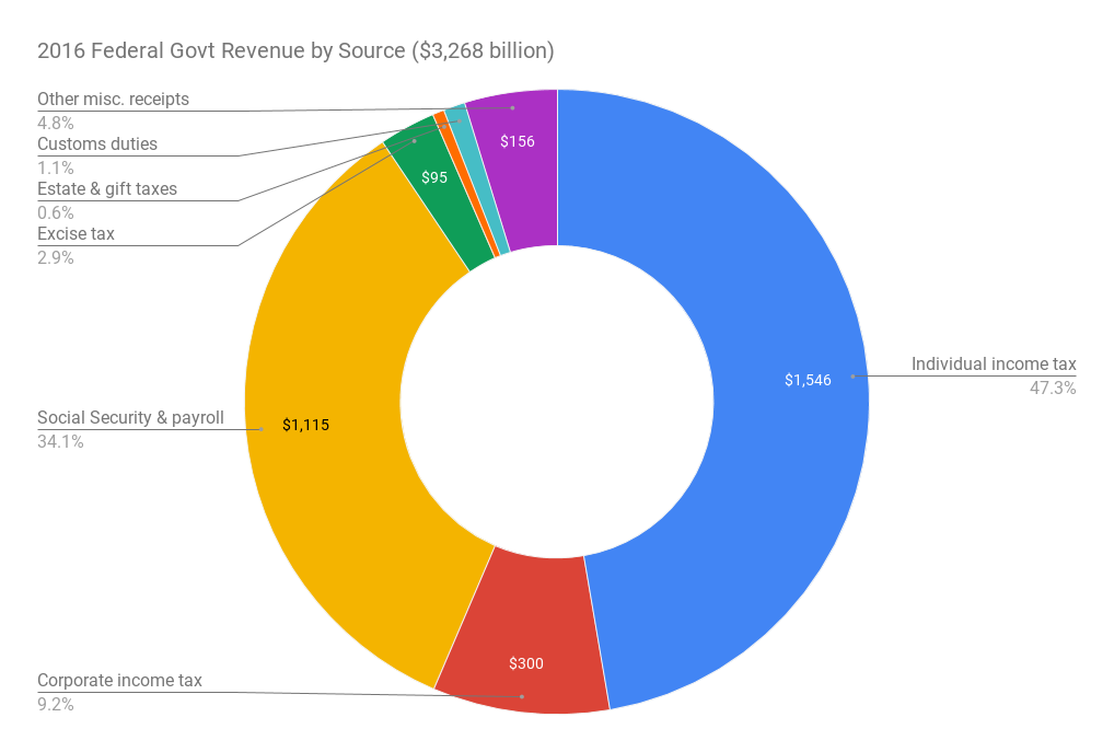
While Individual Income Tax comprises the biggest portion of federal revenue, there are many other sources. Increasing Individual Income Tax is just one way for the government to increase revenue for the sake of wealth redistribution. Elizabeth Warren has proposed a wealth tax, which would be definitely more complicated to instrument than increased income tax, but not unfeasible (Sam Lessin recently published a novel proposal for how to practically implement a wealth tax using a buy-sell agreement and asset registry). Others have proposed increasing Corporate Income Tax (though it is unclear whether this would not ultimately be passed through as some combination of lower wages and/or higher prices). Leaving aside these other options, our focus in this post will primarily be on Individual Income Tax.
Let’s begin by looking at a summary of high level numbers from the income tax and census data:
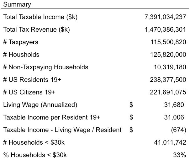
The IRS reported $1.47 trillion in tax revenue from 115 million taxpayers who earned $7.39 trillion in total taxable income. 10.32 million households did not file taxes.
A few other fun facts:
The living wage in 2016 was $15.84 / hr, which annualizes to $31,680 / yr (assuming a 40 hr work week and 50 weeks of work / yr). 33% of households (41 million) earned less than $30k / yr.
The census reported 238 million residents age 19 or older in 2016 (93% of these, 222 million, were citizens). If you divide the total Modified Taxable Income for the country by the number of adult residents, you get $31,006, which is a few hundred dollars short of the living wage – in the pure communist redistribution scenario, every resident would earn less than the living wage (assuming side effects on labor incentives did not reduce total taxable income generated, which almost certainly would happen).
This last fact is so surprising that we are somewhat shocked we have never seen it before.
Here is what the distribution of taxpayers, income, and tax paid by each band:
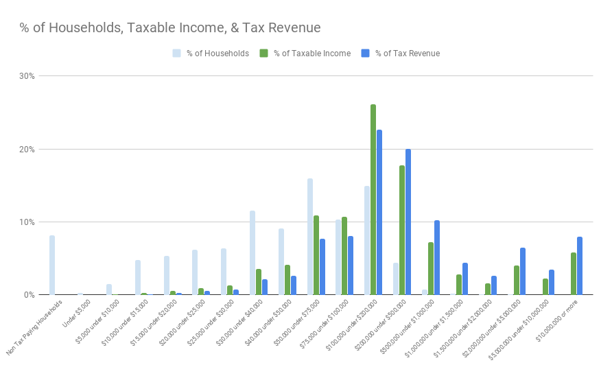
You can see the old adage about the middle class contributing a big share of the tax revenue is true, largely because there are so many households (38%) in the $50k - $200k range.
In business, it’s common to look at cumulative customer contributions to get a sense of the ‘power curve.’ Here is the cumulative picture:
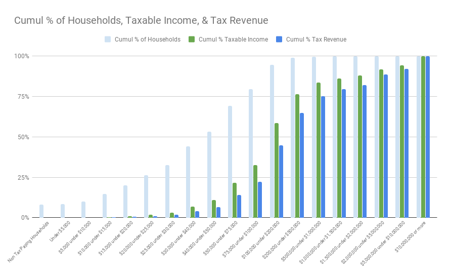
You can see that 80% of households earn less than $100k / yr, comprising 32% of taxable income and 22% of tax revenue. (NB: this is where 80% of the votes are.)
You can also see that only 5.48% of households earn over $200k / yr, and they contribute 55% of the tax revenue.
Contextualizing Results of the Napkin Model
As we started playing with toggles and seeing one scenario would generate $185 billion in additional revenue vs another at $383 billion, everything soon began looking like huge numbers without any practical differences discernible among them.
As a way to understand the practical implications of the surplus revenues generated, we came up with a scorecard of measures to contextualize the proceeds:
-
Total Tax Revenue Generated.
-
Increase vs Base. Surplus revenue was generated vs baseline.
-
% Increase vs Base. Surplus as % increase over baseline.
-
% Tax Rev from Earners < $100k (bottom 80%).
-
% Tax Rev from Earners > $200k (top 5.48%).
-
% Tax Rev from Earners > $1m (top 0.34%).
-
% Tax Rev from Earners > $2m (top 0.12%).
-
As redistribution, $ / Citizen 19+. If we evenly redistributed all additional tax revenue to Citizens age 19+, how much would each get (ie, as UBI)?
-
As redistribution, $ / Household < $30k. If we evenly redistributed all additional tax revenue to Households earning < $30k, how much would each get?
-
As portion of Federal Deficit.
-
As portion of Healthcare 2016 federal spending.
-
As portion of Social Security 2016 federal spending.
-
As portion of Defense 2016 federal spending.
-
As portion of Education (pre primary - secondary) 2016 federal spending.
We do not argue that any increase in tax rates is desirable, nor do we suggest that additional federal investment in these areas is desirable. We only present these comparisons as a way to contextualize the magnitude of the potential incremental tax revenues.
Potential Uses of Proceeds (and Problems with Each)
Before we start toggling tax rates, we should consider the potential uses of proceeds. In general there are three potential uses: 1) reducing the deficit and paying down government debt, 2) increasing government spending, and 3) redistributing capital.
(1) Debt reduction. The US government typically spends more than it collects in revenue, plugging the gap by borrowing money. At some point, that debt will need to be paid off, which is why government debt could be thought of as future taxes (or inflation if the government tries to print money to pay back debt). High deficits and levels of government debt (and the taxes or inflation they portend) may risk capital flight. It is also worth noting that increased taxes on capital gains pose the same risk.
Although we show later what percentage of the 2016 federal deficit might be paid down with surplus revenue and many media pundits use “federal deficit” as a bad word, debt is not necessarily a bad thing (especially when you are the institution that prints money, have the strongest navy in the world, and debt is relatively cheap). Deficit financing of a war or government spending after an economic shock, for example, may be an appropriate way to smooth the burden across multiple generations. The question to ask though is – are we protecting a shared asset, are we creating valuable infrastructure, or are we unduly burdening future generations?
(2) Increased government spending. The US government could put the incremental revenue toward opportunities to improve infrastructure like education, healthcare, transportation, etc., or invest in areas undercapitalized due to market failures. However, increasing revenues in order to fund additional spending in other areas–even if they are inarguably “good things” like education–presupposes the ability to efficiently allocate resources and measure the efficacy of increased spending.
There are well known problems with government allocation of capital, however, perhaps best summarized by Hayek in The Road to Serfdom. First, any sort of centralized decisions about the deployment of government resources–even those decisions made by planners with good intentions–will have a dictatorial tendency (for any spending will benefit some groups at the expense / opportunity cost of benefiting others). It is difficult to refrain from quoting Hayek at length on this topic:
There is an infinite number of good things, which we all agree are highly desirable as well as possible, but of which we cannot hope to achieve more than a few within our lifetime…. We all find it difficult to bear to see things left undone which everybody must admit are both desirable and possible. That these things cannot all be done at the same time, that any one of them can be achieved only at the sacrifice of others, can be seen only by taking into account factors which fall outside any specialism….
The illusion of the specialist that in a planned society he would secure more attention to the objectives for which he cares most is a more general phenomenon than the term “specialist” at first suggests. In our predilections and interests we are all in some measure specialists. And we all think that our personal order of values is not merely personal but that in a free discussion among rational people we would convince the others that ours is the right one…. But, of course, the adoption of the social planning for which they clamor can only bring out the concealed conflict between their aims.
The movement for planning owes its present strength largely to the fact that, while planning is in the main still an ambition, it unites almost all the single-minded idealists, all the men and women who have devoted their lives to a single task. The hopes they place in planning, however, are the result not of a comprehensive view of society but rather of a very limited view and often the result of a great exaggeration of the importance of the ends they place foremost. This is not to underrate the great pragmatic value of this type of men in a free society like ours, which makes them the subject of just admiration. But it would make the very men who are most anxious to plan society the most dangerous if they were allowed to do so—and the most intolerant of the planning of others. From the saintly and single-minded idealist to the fanatic is often but a step. Though it is the resentment of the frustrated specialist which gives the demand for planning its strongest impetus, there could hardly be a more unbearable— and more irrational—world than one in which the most eminent specialists in each field were allowed to proceed unchecked with the realization of their ideals. Nor can “coordination,” as some planners seem to imagine, become a new specialism. The economist is the last to claim that he has the knowledge which the coordinator would need. His plea is for a method which effects such coordination without the need for an omniscient dictator. But that means precisely the retention of some such impersonal, and often unintelligible, checks on individual efforts as those against which all specialists chafe.
Second, even once resources are allocated, execution against the prioritized objectives and measurement of the efficacy of the spend is extremely difficult given the complexity and scale of the (very real) problems the government might intend to solve.
Given the tendency for allocation decisions to reflect the cobbled demands of interest groups combined with the US government’s relatively massive spending and poor performance in most areas relative to other nations, it is understandable that almost no one can stomach tax increases for the sake of increasing government spending. This is one of the most common objections you hear from the rich whenever the government threatens to increase taxes (a common response to @AOC’s 70% tax on the rich to fund a Green New Deal, eg).
(3) Direct redistribution of capital. We could send the proceeds directly back to all citizens (in the form of UBI) or the poorest (in the form of welfare). While that may be much easier to stomach than allowing the planners in Washington DC to try to deploy the proceeds, it is important to remember that any redistribution measures like these would likely have side effects on prices (inflationary pressure due to increased spending) and economic output (due to a decreased incentive to work).
Whew!
Now, although it’s not clear there’s any easy answer for how to effectively use any surplus tax revenue we generate, let’s go start playing with our toggles anyway.
Napkin Model Scenarios
@AOC’s Tax on the Rich
In this scenario, we hold all tax rates constant but increase the effective tax rate on earners > $10 million to 70%. (NB: remember, we should think of the result as a ceiling calculation for tax revenue from @AOC’s plan since she proposed a marginal tax rate and our simplified model’s effective tax rate will yield slightly more tax revenue.)
Here is how this compares to our baseline:
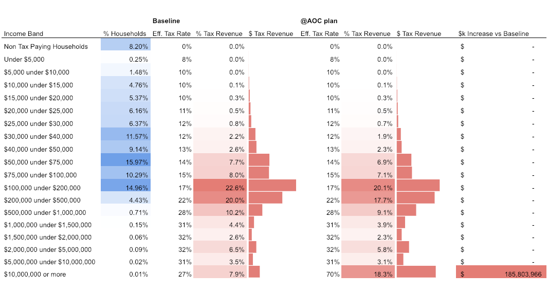
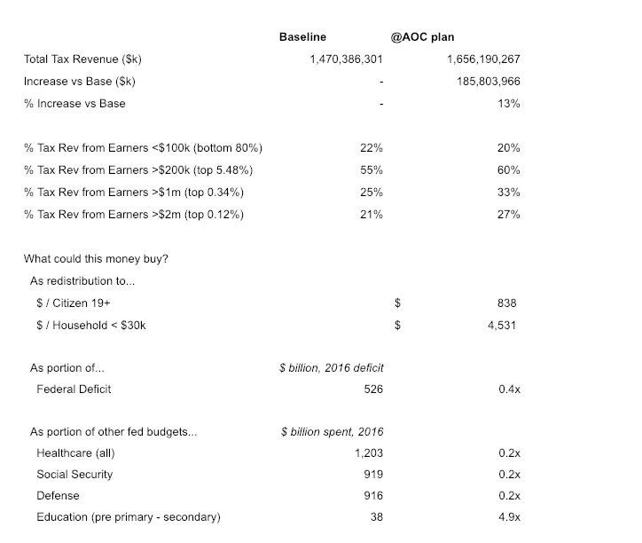
Had the IRS levied this tax in 2016, it would have increased total tax revenue by 13%, bringing in an additional $186 billion in tax revenue from the top 16k taxpayers. This is what you might call ‘high leverage’ ;)
While this sounds like quite a bit in absolute dollar terms, the federal government spent $4.3 trillion in 2016 with a deficit of $526 billion, so it wouldn’t even “get us back in the black.”
Although @AOC has stated that increased revenue would help fund a Green New Deal, it is informative to consider what redistribution of $186 billion looks like. If we took all of the surplus tax revenue generated by the 70% tax on the rich and evenly distributed it to each of the 220 million citizens (age 19+), each person would only get $838. This gives a sense of just how expensive universal basic income would be to fund.
If we evenly distributed to households earning < $30k / yr, each would get $4,531, which is a bit better, but does not meet the “universal” criteria many proponents of basic income argue is necessary for the program to work.
First $30k Tax Free
Another proposal you may have seen floating around the web as part of the @AOC tax conversation is making everyone’s first $30k in earnings tax free.
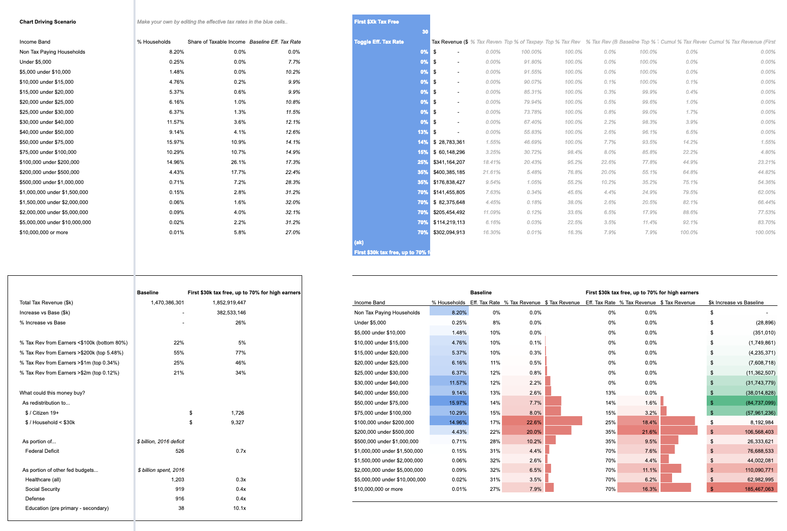
This is not as simple as setting the all the bands below $30k in earnings to a 0% effective tax rate. We also need to subtract out $30k in taxable income from each member of the higher tax bands – we take a haircut in income from every band, not just the lowest:
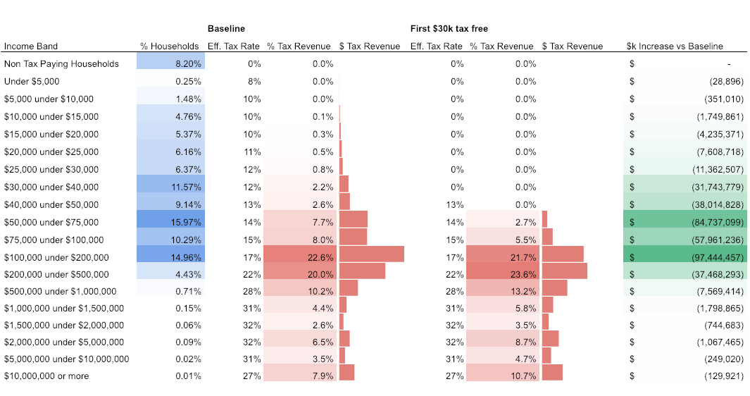
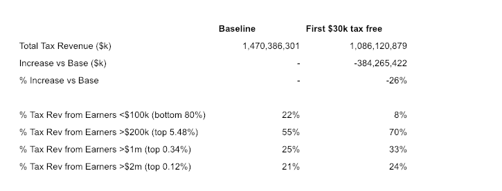
In the last column, you can see how much revenue the government loses from each band. This loss is just a function of the number of taxpayers in each band, so the biggest losses in revenue come from the bands with the most taxpayers: $50k-$75k (16% of taxpayers) and $100k-$200k (15% of taxpayers).
First $30k Tax Free, Up to 70% Tax for High Earners
The idea of your first $30k in earnings being tax free is kind of cool, so let's start playing with our toggles to see how we might fund it.
This model keeps the first $30k tax free, sets the effective tax rate for earnings beyond $30k to 0% for earners up to $40k, maintains the baseline rate for earners up to $100k, then increases it for all earners above $100k, with the highest at 70%:
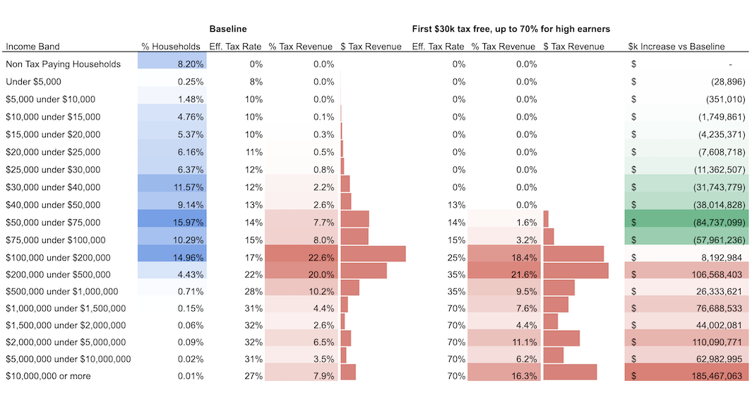
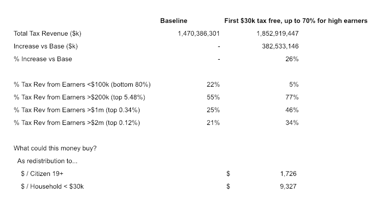
In this scenario, the top 5.48% of earners contribute 77% of tax revenue and the bottom 80% contribute 5%.
We generate $383 billion (26%) more revenue than the baseline case, which might be redistributed as $1,726 per citizen or $9,327 per household earning less than $30k.
A model like this one could be a good way to address growing income and wealth inequality (but of course, per our comments above, the model does not estimate any side effects like those on incentive to work or capital flight).
Bonus Section: Salaries of the Ruling Class
All this talk of increases taxes on the rich brought to mind the idea of leading by example – what better way for government leaders to demonstrate their commitment to economic redistribution than by taking pay cuts themselves?
Here is what the salaries of the leadership in Washington, DC looked like in 2016:
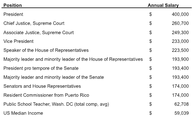
For comparison, we also list the average total compensation for a public school teacher in Washington, DC ($63k) and the US median income ($59k).
The leaders of the US government earn ~ 3-4x the US median income.
A fun idea that came out of this exercise was to peg the salary for all of these roles to the US median income, not because this would generate any sort of meaningful revenue, but as a matter of principle and alignment of incentives.
Conclusion
We had lots of fun and learned quite a bit through our napkin exercise, and we encourage you to grab a copy of the spreadsheet and start modeling your own tax regime.
The key toggles are the blue cells J48:J71 which drive the summarized results in D74:S97 in the first sheet, collapsed.
(See the Takeaways First section at the top of the post for the other conclusions.)
This essay was co-authored by Andrew Kortina and Namrata Patel.